Hello everyone, happy Monday! I'm back with another review of a new-to-me indie brand.
I had heard a lot of good things about Reverie Nail Lacquer, and I
finally picked up a few minis from the brand at the beginning of the
year. So let's check them out shall we?
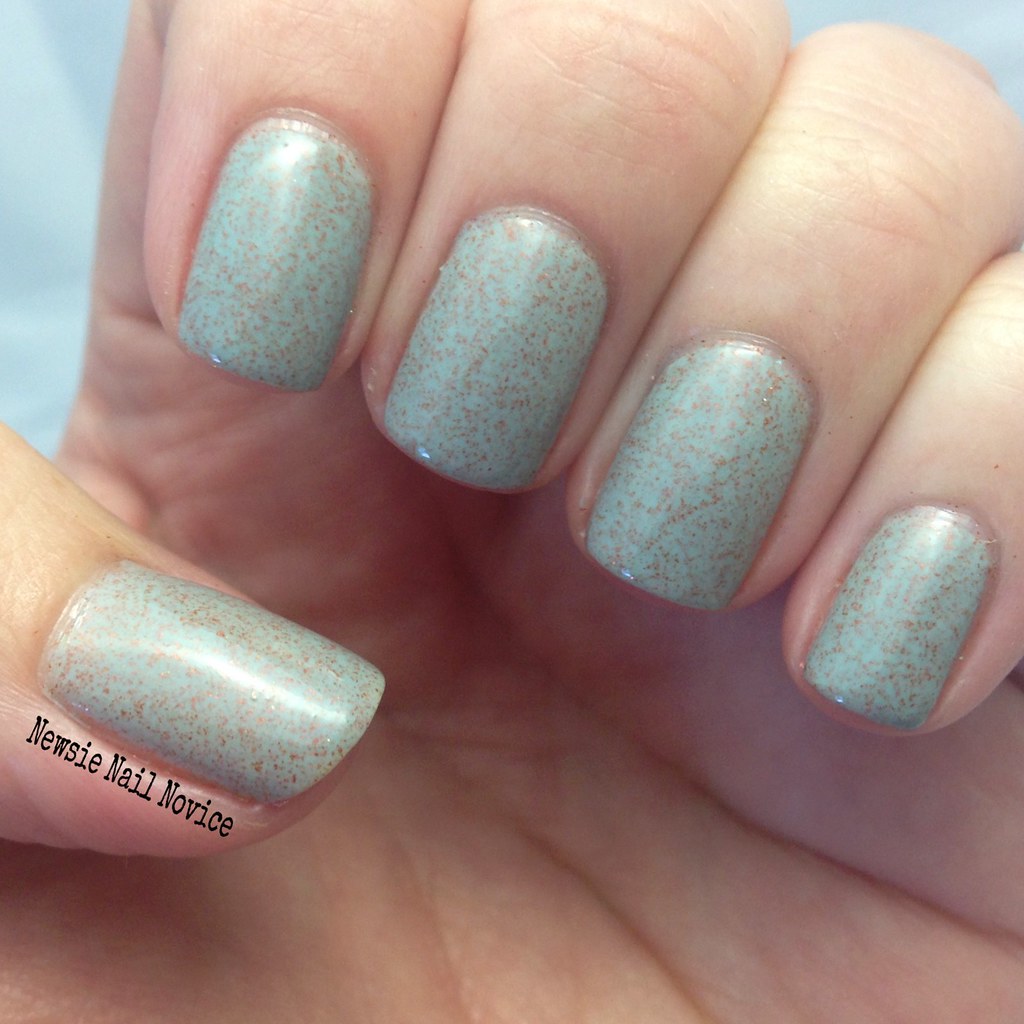
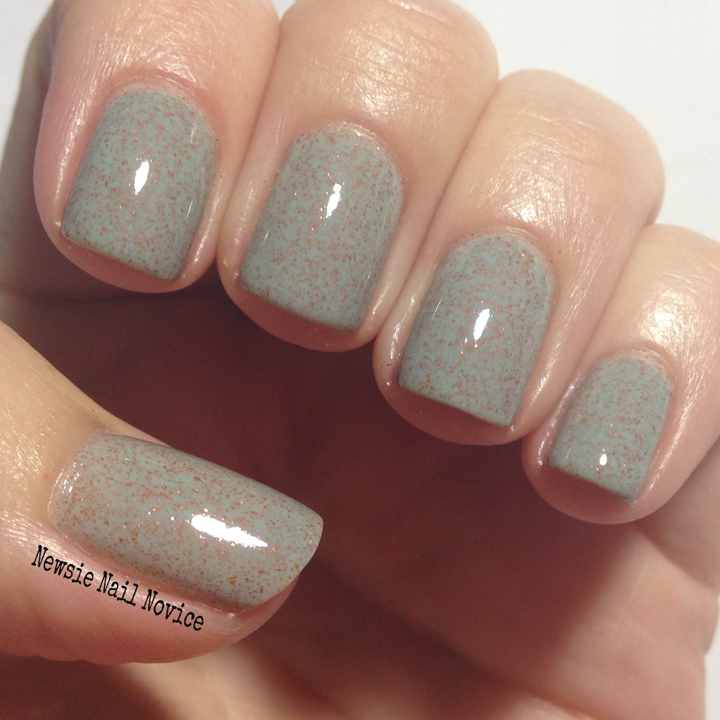
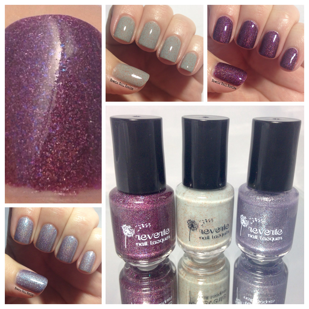
First up we have Agave, which is this lovely grey blue jelly polish with copper micro glitters and rose colored flakies swimming throughout. The polish was a bit on the watery side, but not too difficult to manage. Being a jelly polish, this took three coats to reach this opacity.
This polish was so unique, I haven't seen anything like it. When I first ordered it I just thought it was a grey/copper polish, but then after applying I saw that pink flash. So creative!
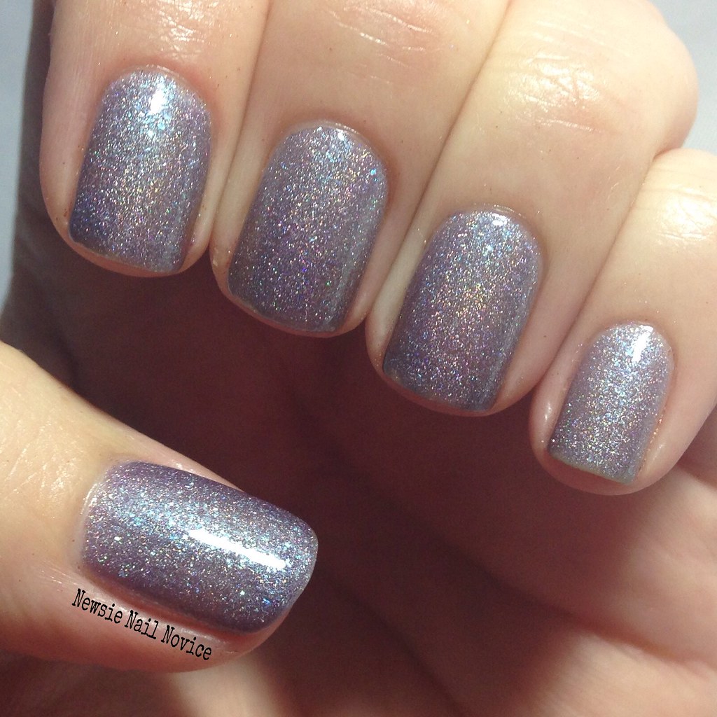
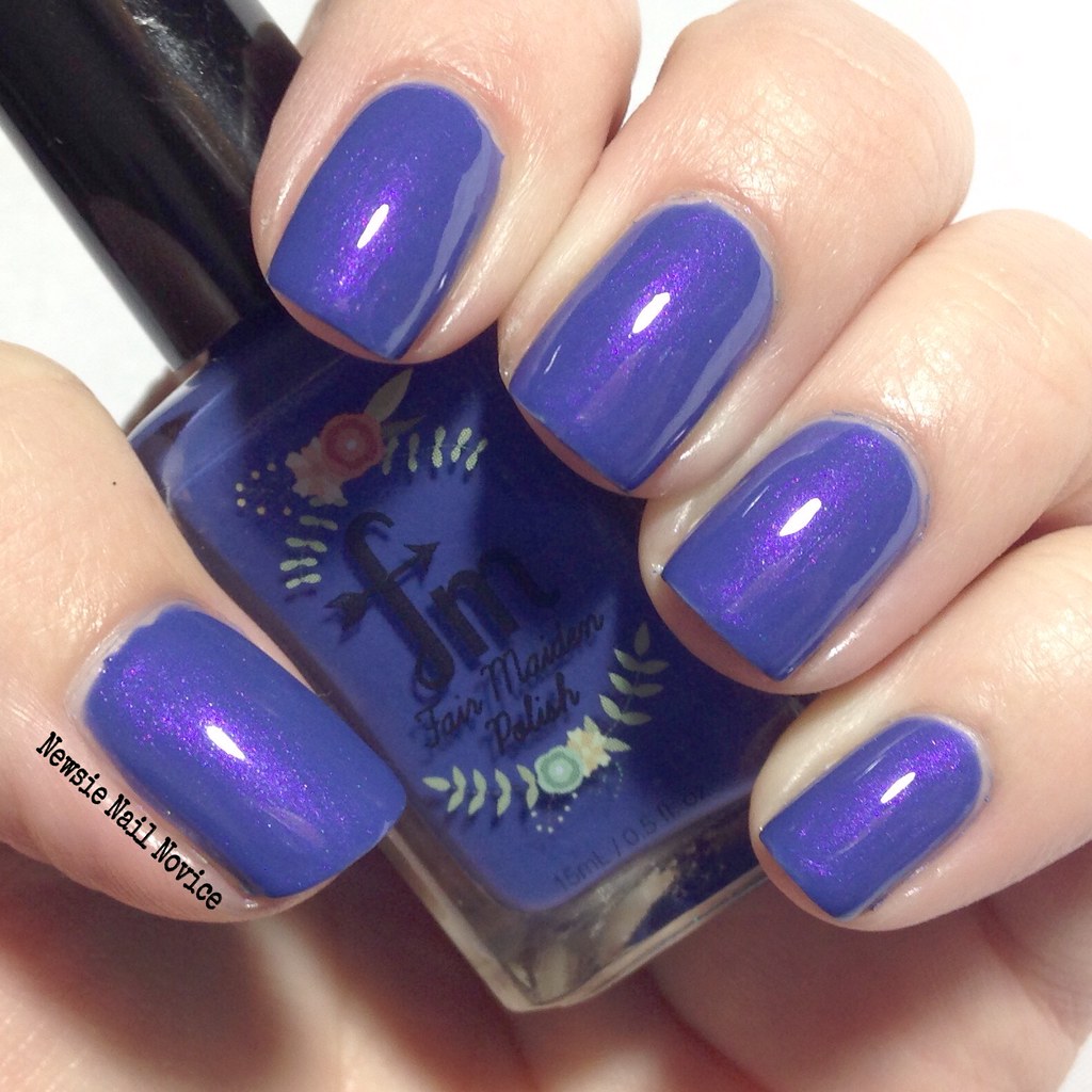
Next up we have Nightfall. This polish is a light lilac purple polish with a holo finish and light blue irredescent flakies packing a punch. This polish was on the thicker side, however it was very sheer. Took three coats for this opacity.
This polish isn't really the color for me, it's very muted for a pastel, and with my skin tone, ends up looking a little washed out. Nothing against the polish itself, I did like how it wasn't just a straight holo polish, those blue flakies really give it something that makes it stand apart. I think I might have liked it more if it were a tad brighter, but that's just my taste, nothing against the polish itself.
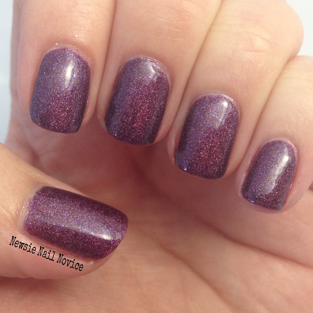
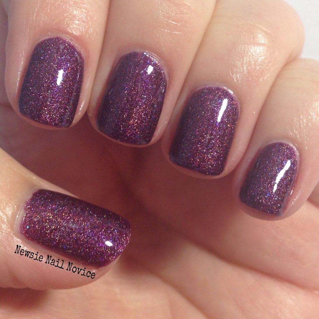
And finally, we have Bayberry. This polish was definitely my favorite in appearance. Just look at that plum purple vampy holo finish. And it doesn't stop there, it has the same type of iridescent flakies as Nightfall, but these are a bright blue leaning violet, leaving a lovely flash. I tried to get a macro of it that showed off both the lovely bold color and the flash of violet!
Unfortunately though, the application on this one was a miss for me. It was thick to the point of being goopy, and that made it very hard to apply. This really is a shame is a shame because just look at that color. Now I know this made a few other blogger's best of lists, so I can only hope that maybe because I got a mini polish, that might have altered the quality of the polish in some way, shape or form. I just don't know.
Anyway, overall I was impressed with the creativity of these three polishes I picked up. They weren't just one thing, a holo or microglitter. They each had something special that set them apart from other indie polishes in my collection. So the ingenuity of Reverie Lacquer definitely has me intrigued. I think next time I order though, I'll try getting at least one full size to see if that affected the polish I purchased, because man, Bayberry is just amazing!
The Reverie Lacquer site is closed at the moment, and I think she is reopening soon with her own website (but word on the street is she'll keep both the Etsy and a new site). Make sure to follow Reverie Lacquer on Facebook for the very latest updates!
Have you tried Reverie Lacquer? Have a polish to recommend that I haven't checked out yet?!
Monday, March 30, 2015
Friday, March 27, 2015
Abstract Nail Art Quickie
I can't believe I am up this late typing up this post for today (it's almost 1 a.m. here on the West Coast, but I'm pre-typing this for later this morning!). I'm a little nuts so I'll make this one super fast okay?
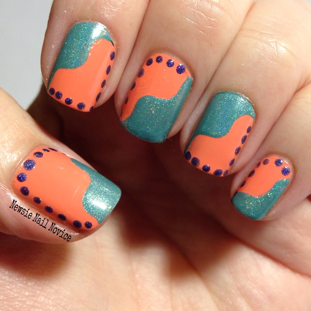
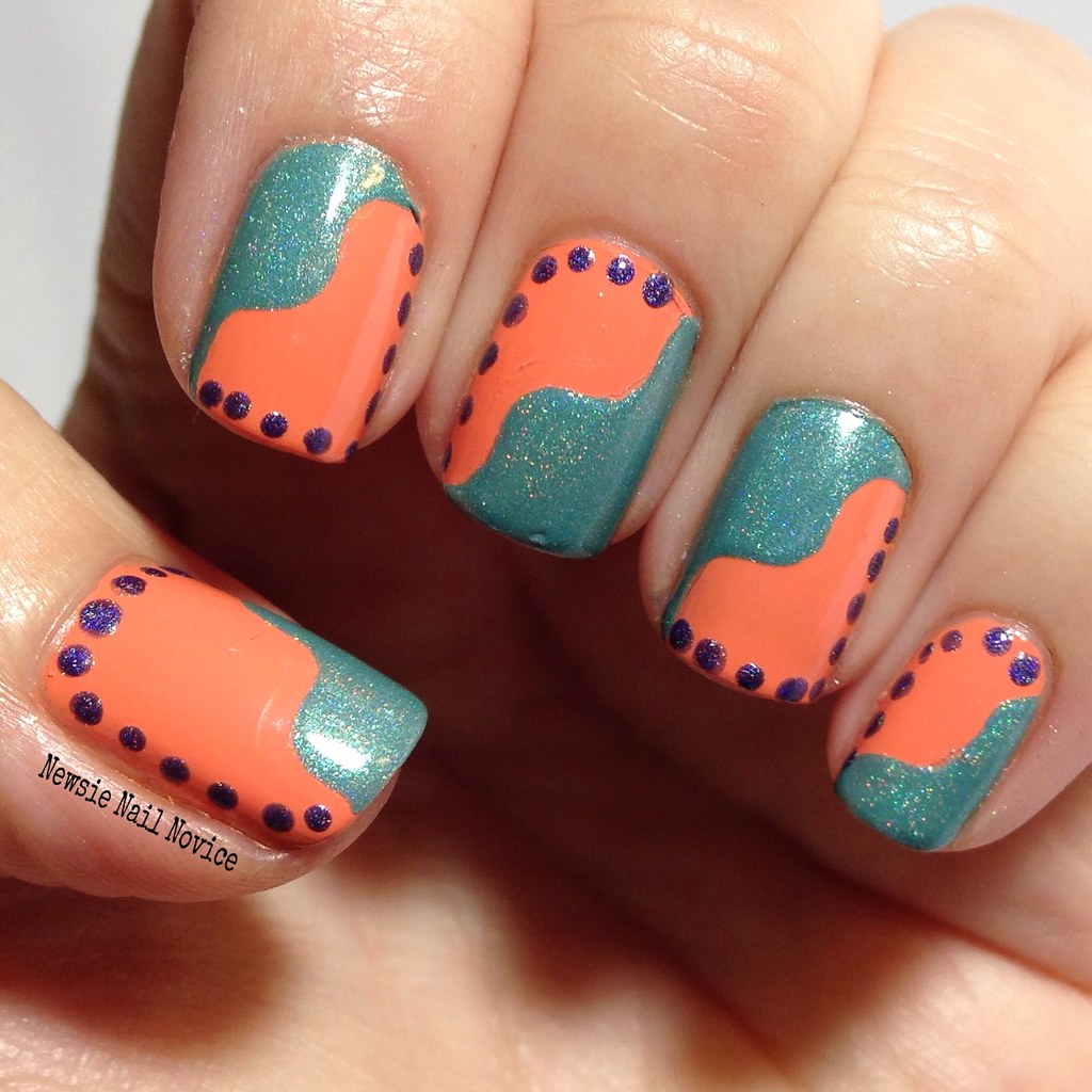
I don't know where my imagination was going when I created this look, but I think I actually kind of like it in an abstract, I-don't-think-I've-seen-something-like-this-before type of look.
To start this look off I had just purchased the base OPI Is Mai Tai Crooked? (careful though, this one is a stainer!!!) and I went in search of some polishes that would contrast/pair well with that beautiful bright pastel orange.
So first I grabbed ILNP Music Box, which is this amazing aqua holographic polish with tiny irridescent flakies of the same color hidden in the polish's creamy holo finish! I used a wavy nail vinyl on each nail in a random design and created the wavy look.
After I finished that step, the look was too boring to me so I wanted to take it up a notch. I went in search for another polish to offset the look, and I don't know what led me to add the dots, but that's what I went with! And for the color I chose Literary Lacquers Mysterious Irrevocable Sacred, which is this amazing blurple linear holo with scattered flakies. I thought the dark blue purple contrasted well with the aqua/orange look.
In the end, I think the final creation looked rather abstract, like a painting or something. Part of me wondered after making this though, if the dots wouldn't have been better placed along the wavy line instead of the exterior of the nail? Who knows though.
Have you ever created a look that just baffles you because it came out of no where? That is this look for me! Hope you liked it! It is waaaaaaay too late now and I need to be getting some sleep ASAP! Hope you all have wonderful weekends ahead!
Wednesday, March 25, 2015
Coral Polish Comparison Showdown
I don't know about you but warmer weather always gets me longing for a good coral manicure. And being that coral is one of my absolute favorite nail polish colors, you better believe I have a bounty of it!
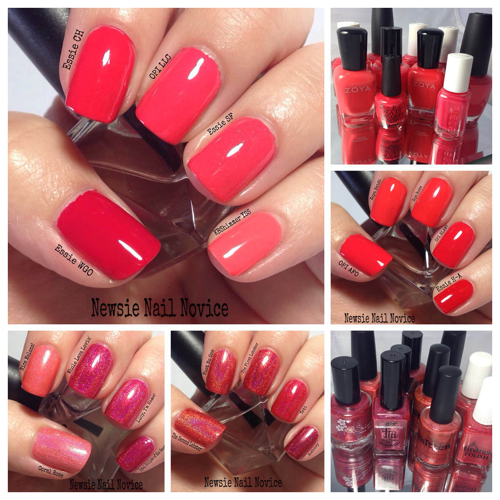
And boy do I have a ton of coral polishes! There are all different types of corals. Pink leaning, red leaning, orange leaning. For the purposes of this post, I decided to compare all my cremes and holos that were in the coral family.
Let's start with the creme's first. I'll start with the pinker leaning polishes to start off with!
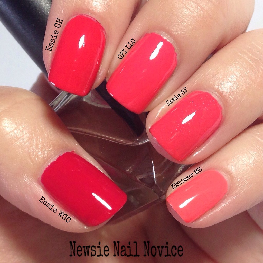
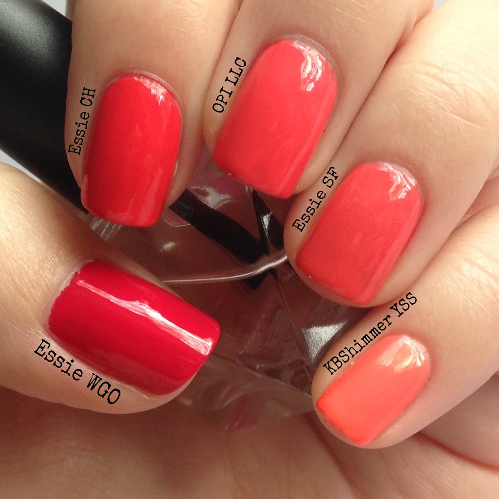
From thumb to pinkie we have:
Essie Wife Goes On: This is a gorgeous pink leaning coral, but truly more of a watermelon color. A great summer color! This is two coats.
Essie Come Here: This was my favorite of these five polishes. My favorite type of coral is a more red orange leaning coral that is still bright. This is two coats.
OPI Live.Love.Carnival: This is a lighter, pinker coral than Come Here. This is a great bright color, but a bit to pink for my liking. This is two coats.
Essie Sunday Funday: This polish is almost practically a dupe for Live.Love.Carnival if it didn't have these fine silver flakies, which doesn't really make it a true creme I know. This was three coats the formula was pretty watery.
KBShimmer You're So Coral: Honestly, this polish shouldn't even be in the comparison. This polish is a lovely orange/peach leaning coral, but it's more neon than anything, and unfortunately I just couldn't capture it's beauty in this post! This is two coats.
Now on to the darker cremes.
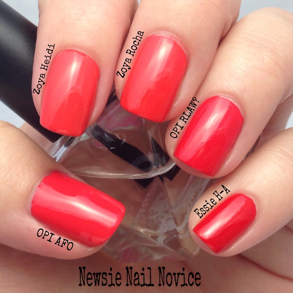
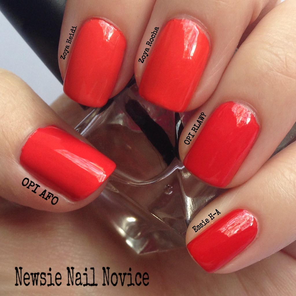
From thumb to pinkie:
OPI Aloha from OPI: This was my newest addition to my coral collection, and the real reason this post came to life. I had to see how my new polish compared to my collection. While I love the color of this one, a bright perfect darker coral, the formula was not great, it took three coats for this opacity.
Zoya Heidi: This polish is an oranger leaning coral, but still a big favorite of mine. This is two coats.
Zoya Rocha: Almost a dupe with Heidi, except it has a very hidden shimmer and is a smidge darker, that you can only detect in certain lighting. This is two coats.
OPI Red Lights Ahead, Where?: My all time favorite coral, and it still holds true. More of a red orange coral, bright and pigmented. I just love this polish and it has yet to be dethroned as my favorite coral creme. This is two coats.
Essie Hip-Anema: This polish is less of a coral and more of a tomato red-orange. Still bright and well pigmented, and very good for stamping! This is two coats.
Now on to the indie holos! Some of these are a stretch for coral, but I picked all my polishes in the pink/orange/reddish coral family. We'll start with the lighter/pinker colors.
From thumb to pinkie:
Different Dimension Coral Rose: This is truly in the lighter pink coral category and was my first coral holo polish. I do like it, but I favor a more bright and vibrant, less pink holo! This polish took three coats for this opacity.
Colors by Llarowe Nice Melons!: This is less of a coral and more of an orange peach holo. This polish was very bright, but had the weakest holo glow of the lot of holos I feature in this post. This was opaque in two coats.
KBShimmer Whole Lava Lovin': This polish is a bright pink holo that leans more cherry to me. Though it looks very similar to the next two polishes, it is a tad lighter, just didn't really photograph that way. It is happy and bright and fun, this is two coats.
Colors by Llarowe Lucy, I'm Home!:This is a bright pink coral holo that is just lovely. When I originally purchased this, I thought my search for the perfect coral holo was over, that was until I discovered the world of orange-red holos (my more preferred coral family color). This is two coats.
Fair Maiden Polish Total Eclipse of the Heart: This polish is a tad darker than the previous two, but is the brightest polish of the group, but leans a darker more raspberry pink holo polish with stronger violet undertones. This is two coats.
Now on to the orange/red holos!
Smitten Polish The Second Lobster: This polish was an oops mini batch from Smitten, and I just had to get it since I love The First Lobster so much. It basically is a lighter less bright version of The First Lobster (middle finger). This also had a thinner formula and required three coats for opacity.
KBShimmer Rust No One: This polish leans just a tad more orange and darker than The Second Lobster, but is a really gorgeous orange leaning coral in my eyes. I just love this polish. This is two coats.
Smitten Polish The First Lobster: I think this polish still holds the title of my favorite coral polish, though some wouldn't classify it as such. But this is one of my absolute all time favorites, it is bright and the perfect amount of red-orange holo. This is two coats.
Elevation Polish Yeti Hides in the Mini Apple: This polish popped up this year and quickly stole my heart. I thought it was a real contender to maybe dethrone The First Lobster in my heart at my top coral holo, but this is a more cherry holo. Still gorgeous and amazing in its own right. The formula was perfection, almost a one coater. This polish also had a golden shimmer and flakies inside, setting it apart from the other classic holo finishes featured here.
Bear Pawlish Bathory: Bear Pawlish is a newer to me brand that I haven't had a ton of time to play with. I threw it into this post, because I orignally purchased this polish because I thought it might be in this family of color. It's not, instead is a gorgeous smoky raspberry, a perfect fall holo in my opinion. I have nothing in my collection like it. This is two coats.
So which polishes win here? Well everyone's taste here differs. For me, I would have to say my two favorite cremes are Essie Come Here and OPI Red Lights Ahead Where? And for the holo category I would have to say Smitten Polish The First Lobster and Elevation Polish Yeti Hides in the Mini Apple.
But there is a shade of coral here for everyone to love. How do you like your corals, more light than dark? More orange leaning or pink leaning?
Have any coral recommendations for me to check out?! None of these are actual dupes of each other, they are just close, which is why I feel justified in owning them all! :-) Hope you enjoyed this post, it was a lot of work to put together!!!
And boy do I have a ton of coral polishes! There are all different types of corals. Pink leaning, red leaning, orange leaning. For the purposes of this post, I decided to compare all my cremes and holos that were in the coral family.
Let's start with the creme's first. I'll start with the pinker leaning polishes to start off with!
From thumb to pinkie we have:
Essie Wife Goes On: This is a gorgeous pink leaning coral, but truly more of a watermelon color. A great summer color! This is two coats.
Essie Come Here: This was my favorite of these five polishes. My favorite type of coral is a more red orange leaning coral that is still bright. This is two coats.
OPI Live.Love.Carnival: This is a lighter, pinker coral than Come Here. This is a great bright color, but a bit to pink for my liking. This is two coats.
Essie Sunday Funday: This polish is almost practically a dupe for Live.Love.Carnival if it didn't have these fine silver flakies, which doesn't really make it a true creme I know. This was three coats the formula was pretty watery.
KBShimmer You're So Coral: Honestly, this polish shouldn't even be in the comparison. This polish is a lovely orange/peach leaning coral, but it's more neon than anything, and unfortunately I just couldn't capture it's beauty in this post! This is two coats.
Now on to the darker cremes.
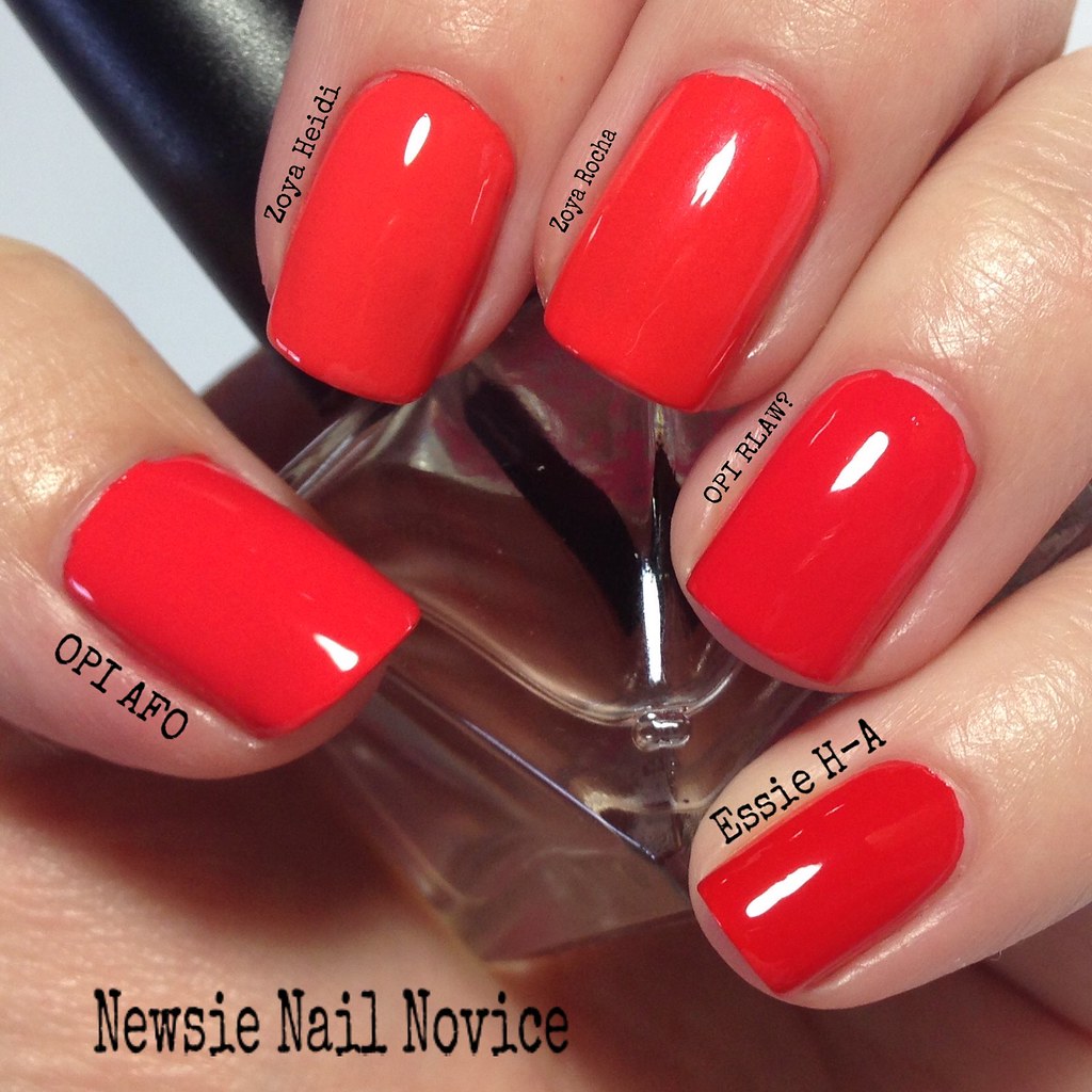
From thumb to pinkie:
OPI Aloha from OPI: This was my newest addition to my coral collection, and the real reason this post came to life. I had to see how my new polish compared to my collection. While I love the color of this one, a bright perfect darker coral, the formula was not great, it took three coats for this opacity.
Zoya Heidi: This polish is an oranger leaning coral, but still a big favorite of mine. This is two coats.
Zoya Rocha: Almost a dupe with Heidi, except it has a very hidden shimmer and is a smidge darker, that you can only detect in certain lighting. This is two coats.
OPI Red Lights Ahead, Where?: My all time favorite coral, and it still holds true. More of a red orange coral, bright and pigmented. I just love this polish and it has yet to be dethroned as my favorite coral creme. This is two coats.
Essie Hip-Anema: This polish is less of a coral and more of a tomato red-orange. Still bright and well pigmented, and very good for stamping! This is two coats.
Now on to the indie holos! Some of these are a stretch for coral, but I picked all my polishes in the pink/orange/reddish coral family. We'll start with the lighter/pinker colors.
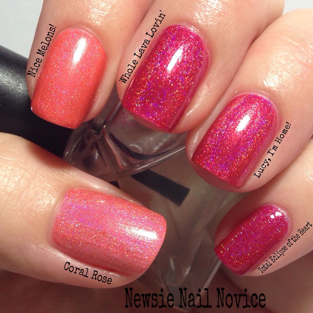
From thumb to pinkie:
Different Dimension Coral Rose: This is truly in the lighter pink coral category and was my first coral holo polish. I do like it, but I favor a more bright and vibrant, less pink holo! This polish took three coats for this opacity.
Colors by Llarowe Nice Melons!: This is less of a coral and more of an orange peach holo. This polish was very bright, but had the weakest holo glow of the lot of holos I feature in this post. This was opaque in two coats.
KBShimmer Whole Lava Lovin': This polish is a bright pink holo that leans more cherry to me. Though it looks very similar to the next two polishes, it is a tad lighter, just didn't really photograph that way. It is happy and bright and fun, this is two coats.
Colors by Llarowe Lucy, I'm Home!:This is a bright pink coral holo that is just lovely. When I originally purchased this, I thought my search for the perfect coral holo was over, that was until I discovered the world of orange-red holos (my more preferred coral family color). This is two coats.
Fair Maiden Polish Total Eclipse of the Heart: This polish is a tad darker than the previous two, but is the brightest polish of the group, but leans a darker more raspberry pink holo polish with stronger violet undertones. This is two coats.
Now on to the orange/red holos!
Smitten Polish The Second Lobster: This polish was an oops mini batch from Smitten, and I just had to get it since I love The First Lobster so much. It basically is a lighter less bright version of The First Lobster (middle finger). This also had a thinner formula and required three coats for opacity.
KBShimmer Rust No One: This polish leans just a tad more orange and darker than The Second Lobster, but is a really gorgeous orange leaning coral in my eyes. I just love this polish. This is two coats.
Smitten Polish The First Lobster: I think this polish still holds the title of my favorite coral polish, though some wouldn't classify it as such. But this is one of my absolute all time favorites, it is bright and the perfect amount of red-orange holo. This is two coats.
Elevation Polish Yeti Hides in the Mini Apple: This polish popped up this year and quickly stole my heart. I thought it was a real contender to maybe dethrone The First Lobster in my heart at my top coral holo, but this is a more cherry holo. Still gorgeous and amazing in its own right. The formula was perfection, almost a one coater. This polish also had a golden shimmer and flakies inside, setting it apart from the other classic holo finishes featured here.
Bear Pawlish Bathory: Bear Pawlish is a newer to me brand that I haven't had a ton of time to play with. I threw it into this post, because I orignally purchased this polish because I thought it might be in this family of color. It's not, instead is a gorgeous smoky raspberry, a perfect fall holo in my opinion. I have nothing in my collection like it. This is two coats.
So which polishes win here? Well everyone's taste here differs. For me, I would have to say my two favorite cremes are Essie Come Here and OPI Red Lights Ahead Where? And for the holo category I would have to say Smitten Polish The First Lobster and Elevation Polish Yeti Hides in the Mini Apple.
But there is a shade of coral here for everyone to love. How do you like your corals, more light than dark? More orange leaning or pink leaning?
Have any coral recommendations for me to check out?! None of these are actual dupes of each other, they are just close, which is why I feel justified in owning them all! :-) Hope you enjoyed this post, it was a lot of work to put together!!!
Monday, March 23, 2015
ILNP Fame, Timeless Vow and Peri Me
So last week I received a super hefty order from ILNP Spring Collection, which I happened to purchase during the preorder phase. These polishes, along with a ton of other amazing polishes, will be available in early April. I just loved these looks so much that I wanted to share them now!
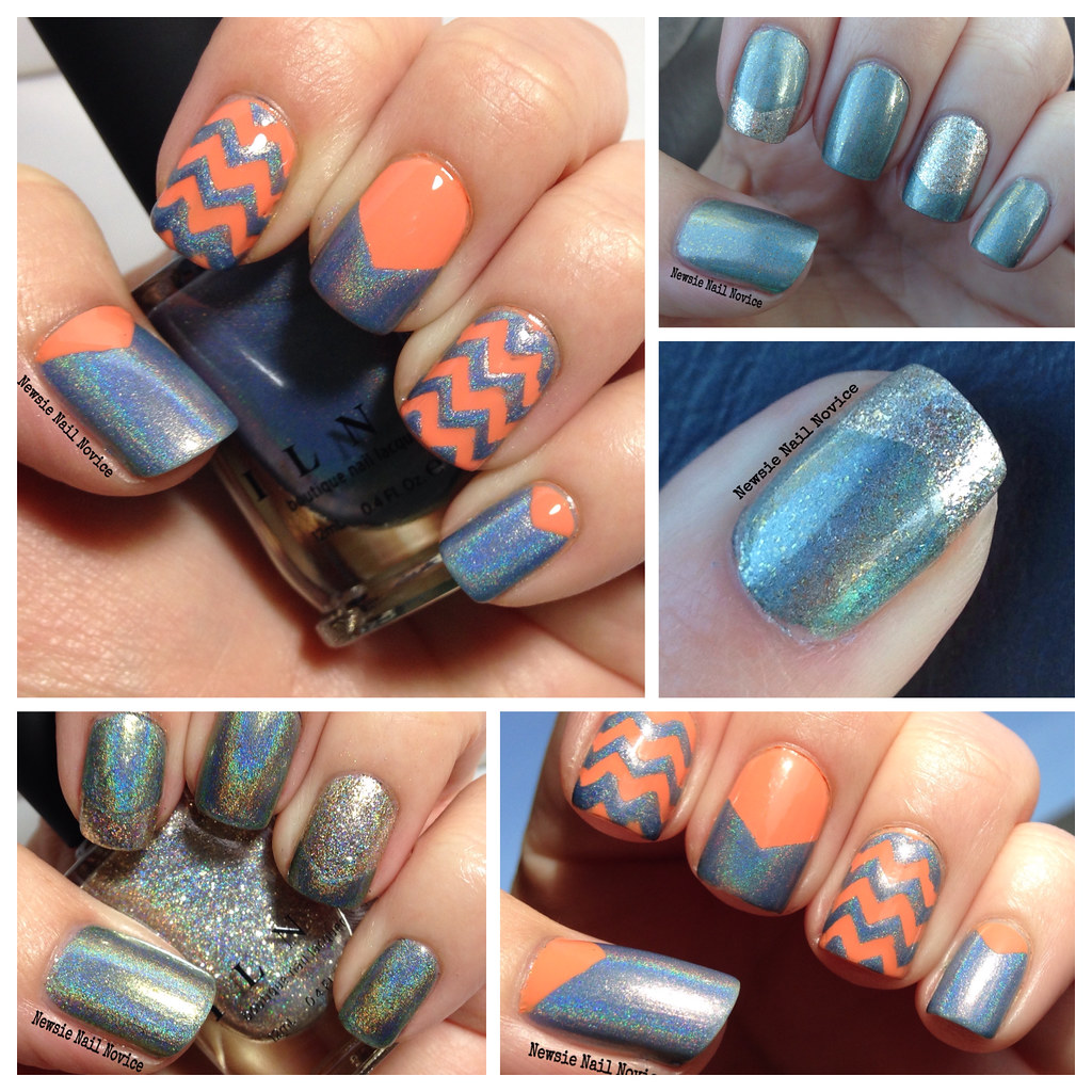
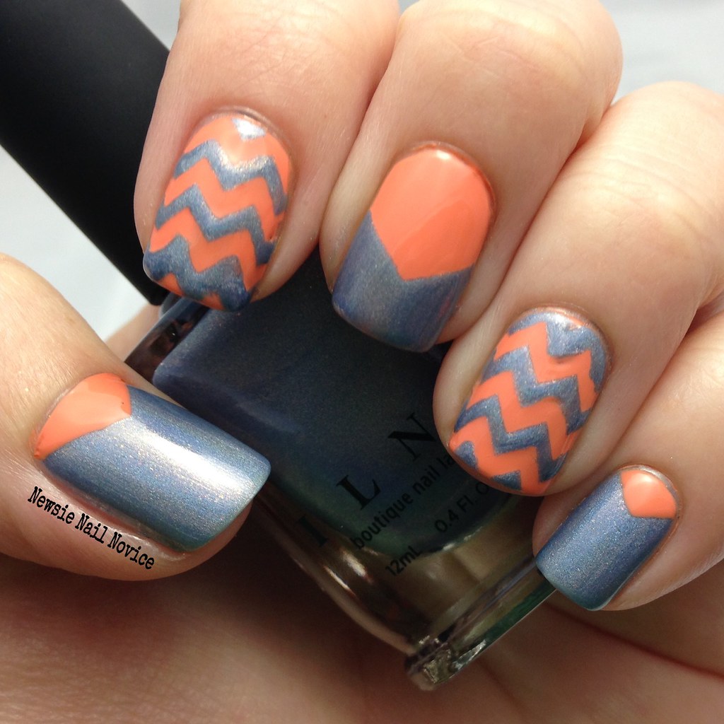
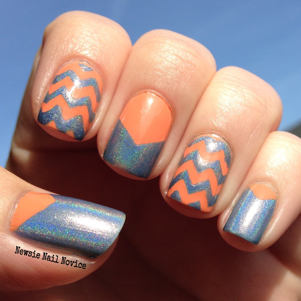
I just used nail vinyls to create these looks. I used KBShimmers Chevron guides and Nail Vinyls Single Chevrons.
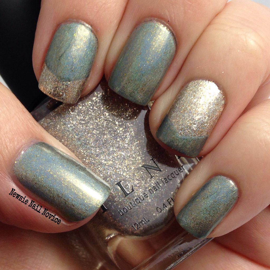
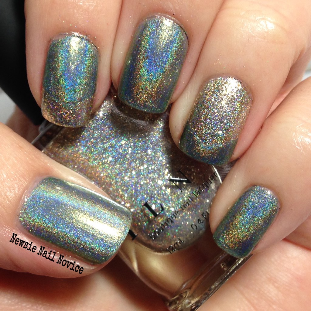
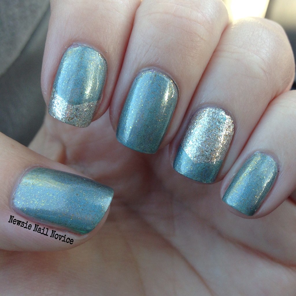
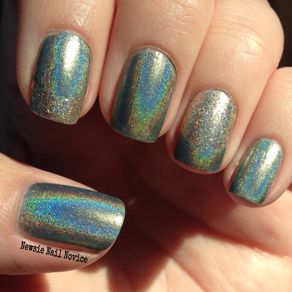
The first look I created I chose two polishes I got that I thought were complimentary to each other! Timeless Vow is a sage green holographic polish with bronze gold flakies scattered throughout. The holo in this is very strong in the sun, and in the shade the bronze flakies come out to play! The formula was on the thicker side, but not impossible to work with. Beware of brushstrokes, it's not as bad in that regard as other polishes, but they do still occur (see pointer finger). This application was opaque in 2 coats.
Fame is a super reflective silver flakie holo with the same bronze flakies interspersed throughout. The bronze flakies are what tie these two polishes together. This polish was super bright and holo in the sun and the in the shade it is super blingy and that is when the bronze flakies appear! This was also opaque in two coats, those flakies are really packed in there!
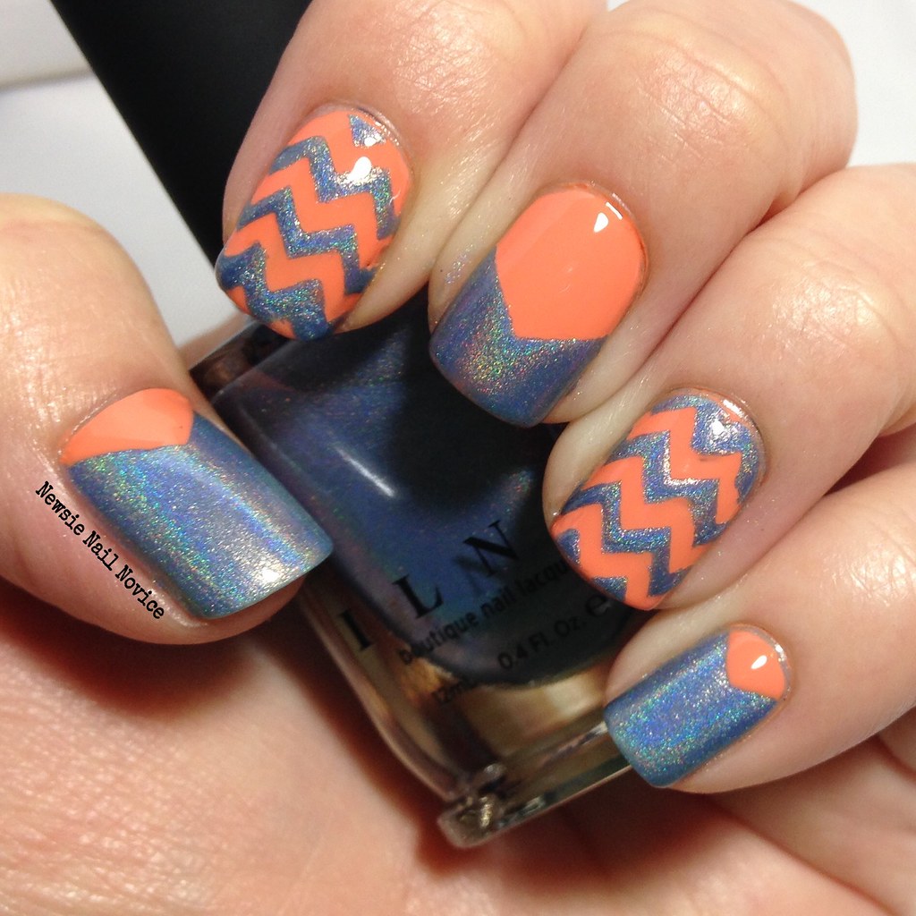
For this second look, I paired ILNP Peri Me with OPI Is Mai Tai Crooked? When I pulled Peri Me outside of the box, I noticed it has this amazing orange glow to is, along with some matching flakies. So that is when I went to my stash to try and pair it with a complimentary polish that would bring that special glow out.
Peri Me is very similar to Timeless Vow in application and appearance, though I didn't have the brush stroke issue. This was opaque in two coats, but I added a third for ultimate holo shine. I really liked Peri Me and I'll definitely be breaking it out again for many manicures. The perfect periwinkle polish – super holo in the sun and subtle flakies and glow in the shade.
A word of warning though, if you want to recreate this look, make sure to use Peri Me as the base polish, then layer the orange on top. I didn't do that for the pointer, middle and ring fingers and I have some nasty stains from OPI Is Mai Tai Crooked? Which is a bummer, but whatever, tis the life of a frequent nail polish wearer.
So did you pick up any ILNP poishes during the presale? Which are your favorites? Looking to pick something up with they are officially released? I still have some holo flakies to share and some more holos from this giant ILNP order I had (thanks to an awesome birthday gift certificate I received), so expect to see those soon!
Labels:
Fame,
ilnp,
ILNP Spring 2015,
Is Mai Tai Crooked,
nail art,
nail vinyls,
OPI,
Peri Me,
Timeless Vow
Friday, March 20, 2015
Elevation Polish Review and Nail Art
I'm really sticking to that whole goal of trying new to me indie brands and today I bring to you the most awesome discovery of Elevation Polish.
Now I have heard about Elevation on and off for a year now, but for some reason I just didn't pay attention. Then came the end of the year, and I was browsing everyone's top polishes of the year and Elevation Polish just kept coming up.
Boy was I silly to not pay attention, I totally understand all the hype. So let's get to the polishes and nail art I did with these wonderful polishes!
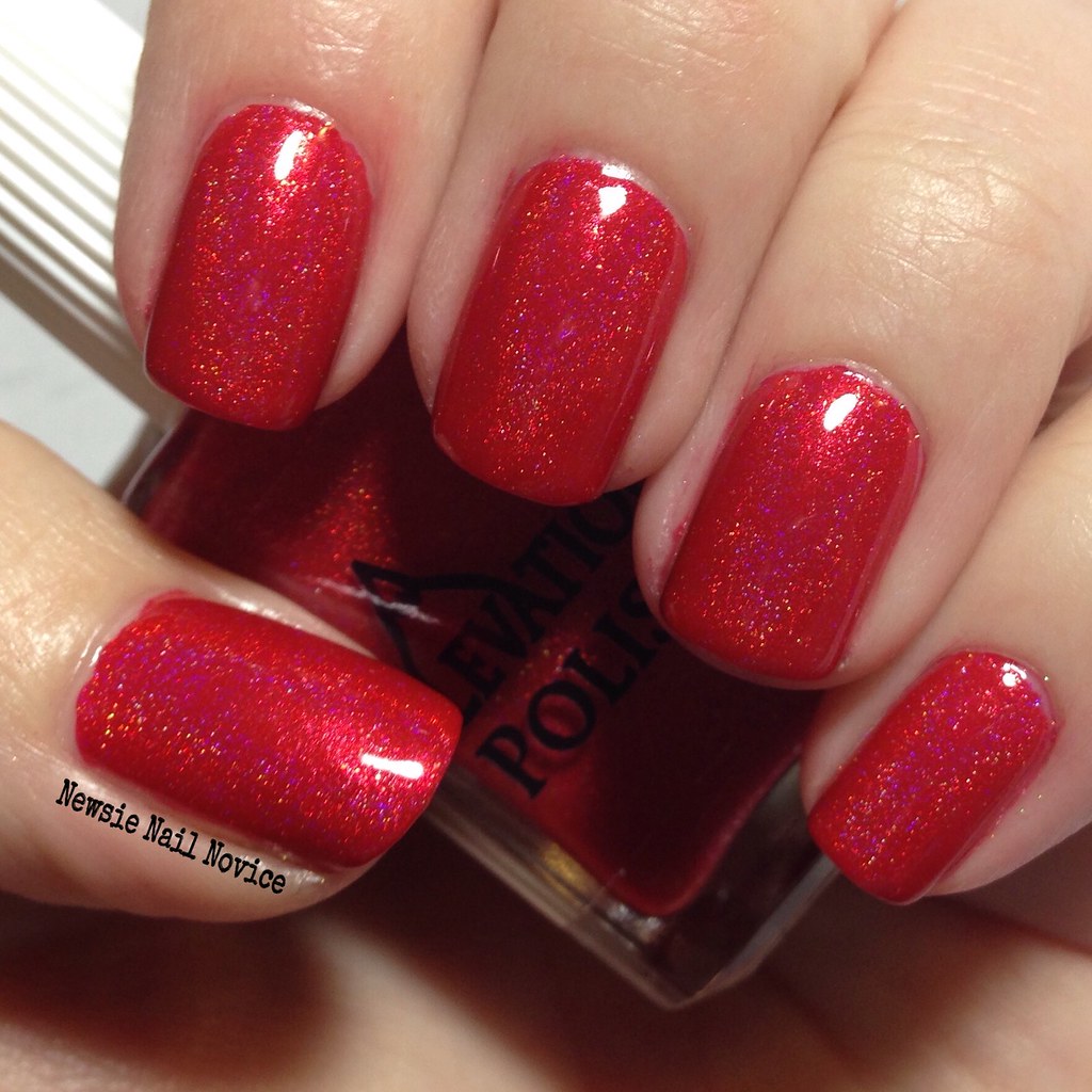
This polish is Elevation Yeti Hides in the Mini Apple, which is a lovely bright tomatoe red holo polish with the most lovely gold flash in it. I feel a bit guilty about sharing it, because it was a limited edition and is no longer available. This one was crazy hard to get, admittedly, I had to cart jack someone in order to get it. But the creator realized its popularity and offered it's second release as a pre-order so everyone could have a chance to have it that month. That's a sign of an awesome maker in my book!
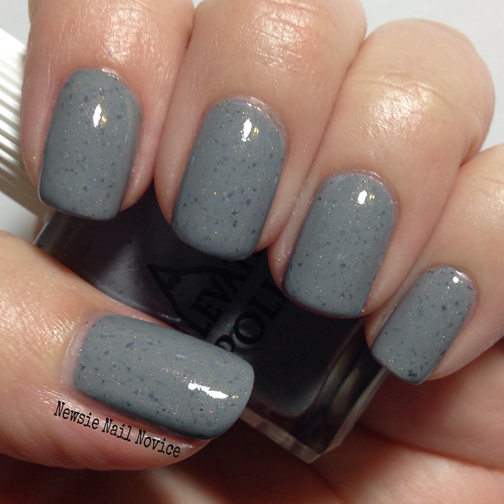
And now on to the application. On all of these polishes the application was flawless and the consistency was not too thick, not too thin but perfect. And each of these polishes was almost a one coater!!! Can you believe it!?!
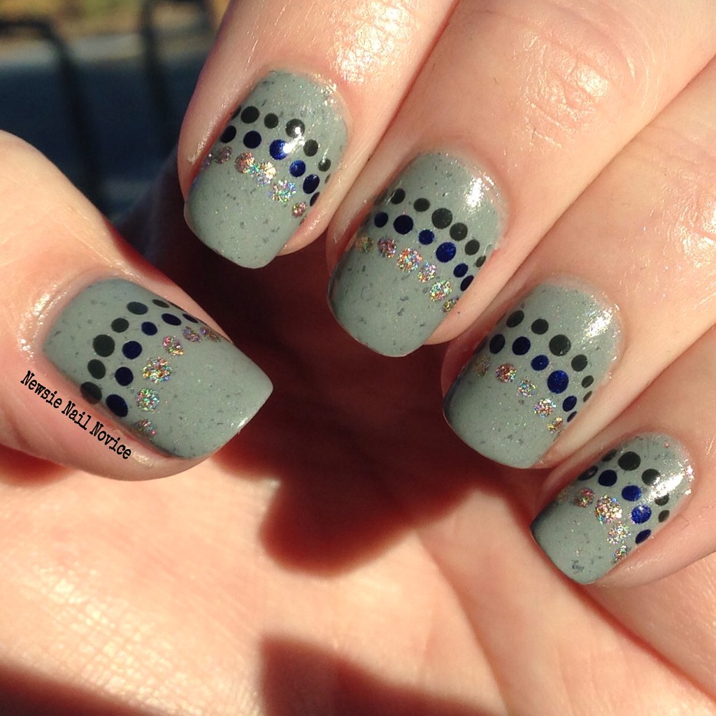
For the nail art above, the first time I wore this, I wore a matching sweater (not on purpose actually) and the shirt I wore underneath was black and white polka dot, and I just thought the combination was too great. So I immediately went home, used a nail vinyl and painted the black and then added the polka dots! It was a lovely combination if I do say so myself! ;-)
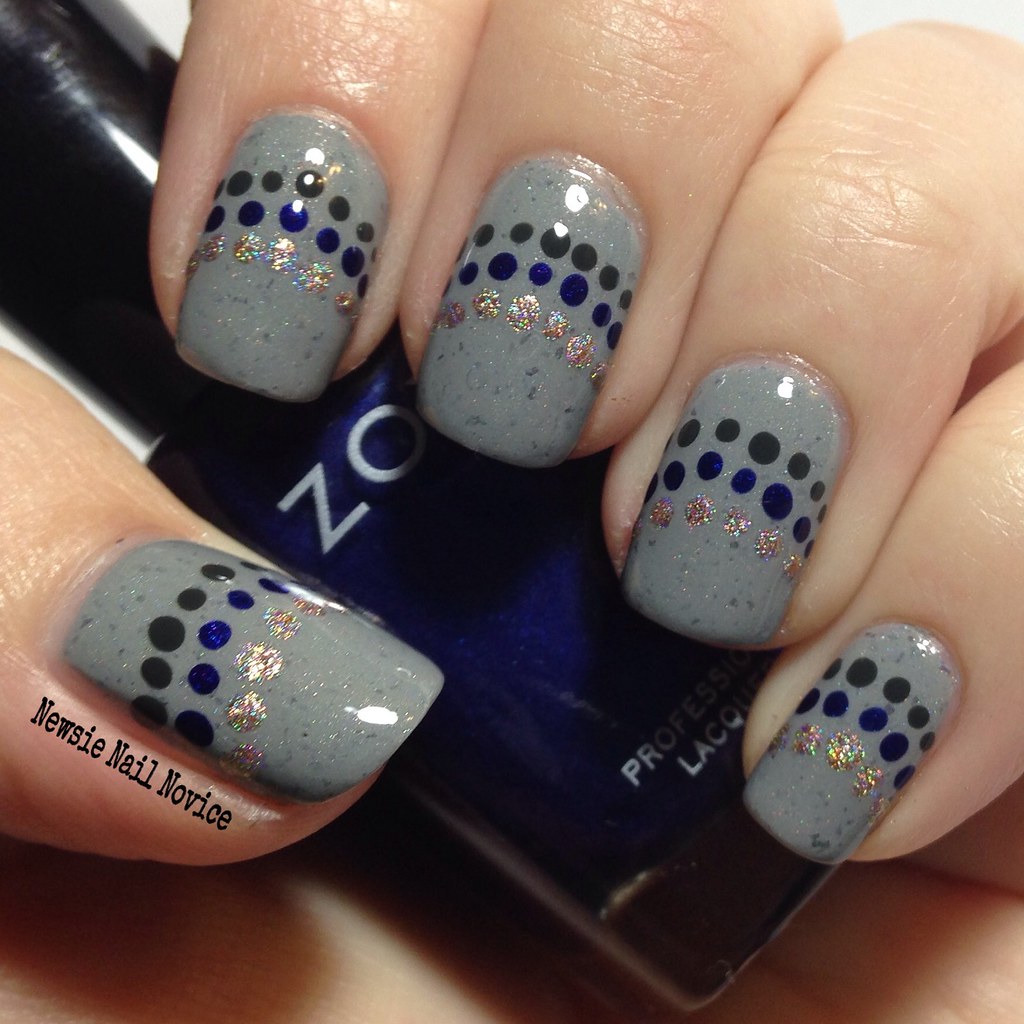
Next up is Shilin Stone Forest, and this polish is a great example of why this brand is so well loved, just look at everything that is going on there. This is a grey creme polish with darker grey scattered flakies, lightly scattered holo, violet flakies and a golden glow. This polish just is so lovely.
So for nail art, I wanted to bring out all the uniqueness of the base, so I decided to break out some complimentary polishes to create a fun dotticure! I used Zoya Neve (dark grey creme), Zoya Neve (blurple shimmer) and Different Dimension Armstrong for the dots. I really loved this look and I totally expect to do something like this again!
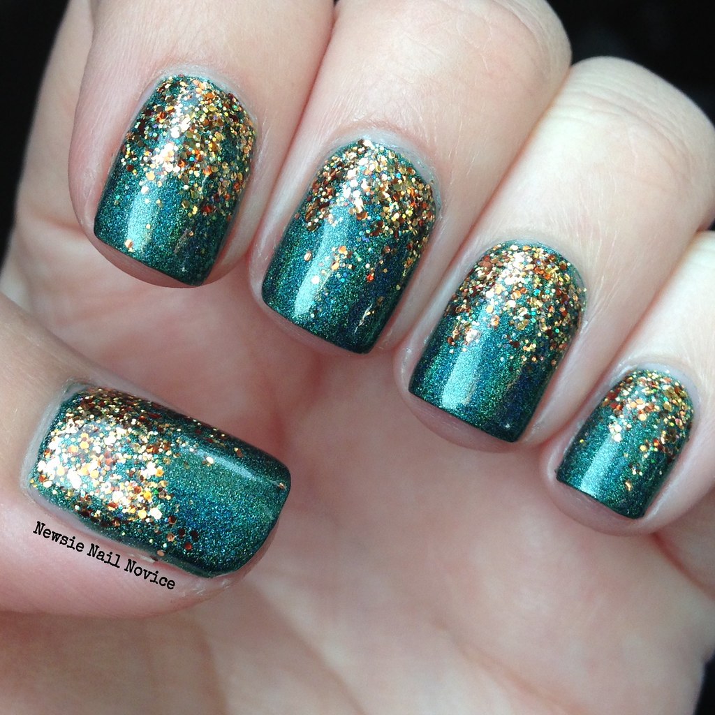
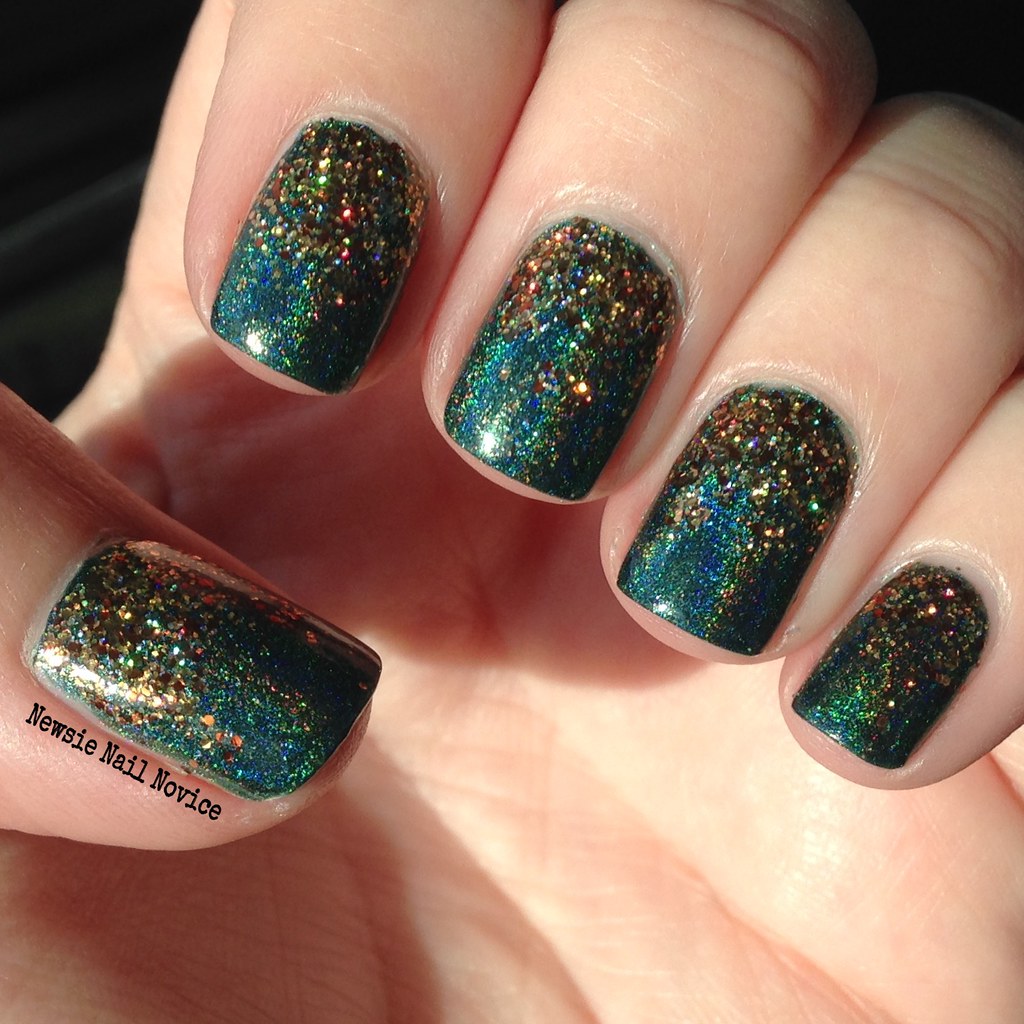
Last up we have Lost in the Darkness 2, which is this amazing forest green holo with amazing almost navy blue flashes in the linear holo finish.
I think I was longing for fall when I put this on, so I decided to add a fun glitter gradient using Painted Polish #PSL (short for Pumpkin Spice Latte), but I guess the green and gold works well for St. Patrick's Day too! I just loved this look, so much sparkle and dimension! Just lovely.
So Elevation Polish is definitely a brand you should check out when you get the chance. Restocking for this brand is always scheduled on the 7th and the 22nd of every month and the website also features a fun upcoming colors page, where the maker previews some of the upcoming collection in descriptions – oh what the imagination can do when reading these! So much fun to anticipate!
So have you checked out this brand before?! What are your favorites? Which should I check out that I haven't yet?
Now I have heard about Elevation on and off for a year now, but for some reason I just didn't pay attention. Then came the end of the year, and I was browsing everyone's top polishes of the year and Elevation Polish just kept coming up.
Boy was I silly to not pay attention, I totally understand all the hype. So let's get to the polishes and nail art I did with these wonderful polishes!
This polish is Elevation Yeti Hides in the Mini Apple, which is a lovely bright tomatoe red holo polish with the most lovely gold flash in it. I feel a bit guilty about sharing it, because it was a limited edition and is no longer available. This one was crazy hard to get, admittedly, I had to cart jack someone in order to get it. But the creator realized its popularity and offered it's second release as a pre-order so everyone could have a chance to have it that month. That's a sign of an awesome maker in my book!
And now on to the application. On all of these polishes the application was flawless and the consistency was not too thick, not too thin but perfect. And each of these polishes was almost a one coater!!! Can you believe it!?!
For the nail art above, the first time I wore this, I wore a matching sweater (not on purpose actually) and the shirt I wore underneath was black and white polka dot, and I just thought the combination was too great. So I immediately went home, used a nail vinyl and painted the black and then added the polka dots! It was a lovely combination if I do say so myself! ;-)
Next up is Shilin Stone Forest, and this polish is a great example of why this brand is so well loved, just look at everything that is going on there. This is a grey creme polish with darker grey scattered flakies, lightly scattered holo, violet flakies and a golden glow. This polish just is so lovely.
So for nail art, I wanted to bring out all the uniqueness of the base, so I decided to break out some complimentary polishes to create a fun dotticure! I used Zoya Neve (dark grey creme), Zoya Neve (blurple shimmer) and Different Dimension Armstrong for the dots. I really loved this look and I totally expect to do something like this again!
Last up we have Lost in the Darkness 2, which is this amazing forest green holo with amazing almost navy blue flashes in the linear holo finish.
I think I was longing for fall when I put this on, so I decided to add a fun glitter gradient using Painted Polish #PSL (short for Pumpkin Spice Latte), but I guess the green and gold works well for St. Patrick's Day too! I just loved this look, so much sparkle and dimension! Just lovely.
So Elevation Polish is definitely a brand you should check out when you get the chance. Restocking for this brand is always scheduled on the 7th and the 22nd of every month and the website also features a fun upcoming colors page, where the maker previews some of the upcoming collection in descriptions – oh what the imagination can do when reading these! So much fun to anticipate!
So have you checked out this brand before?! What are your favorites? Which should I check out that I haven't yet?
Thursday, March 19, 2015
Fair Maiden Polish Garden Party Nail Art
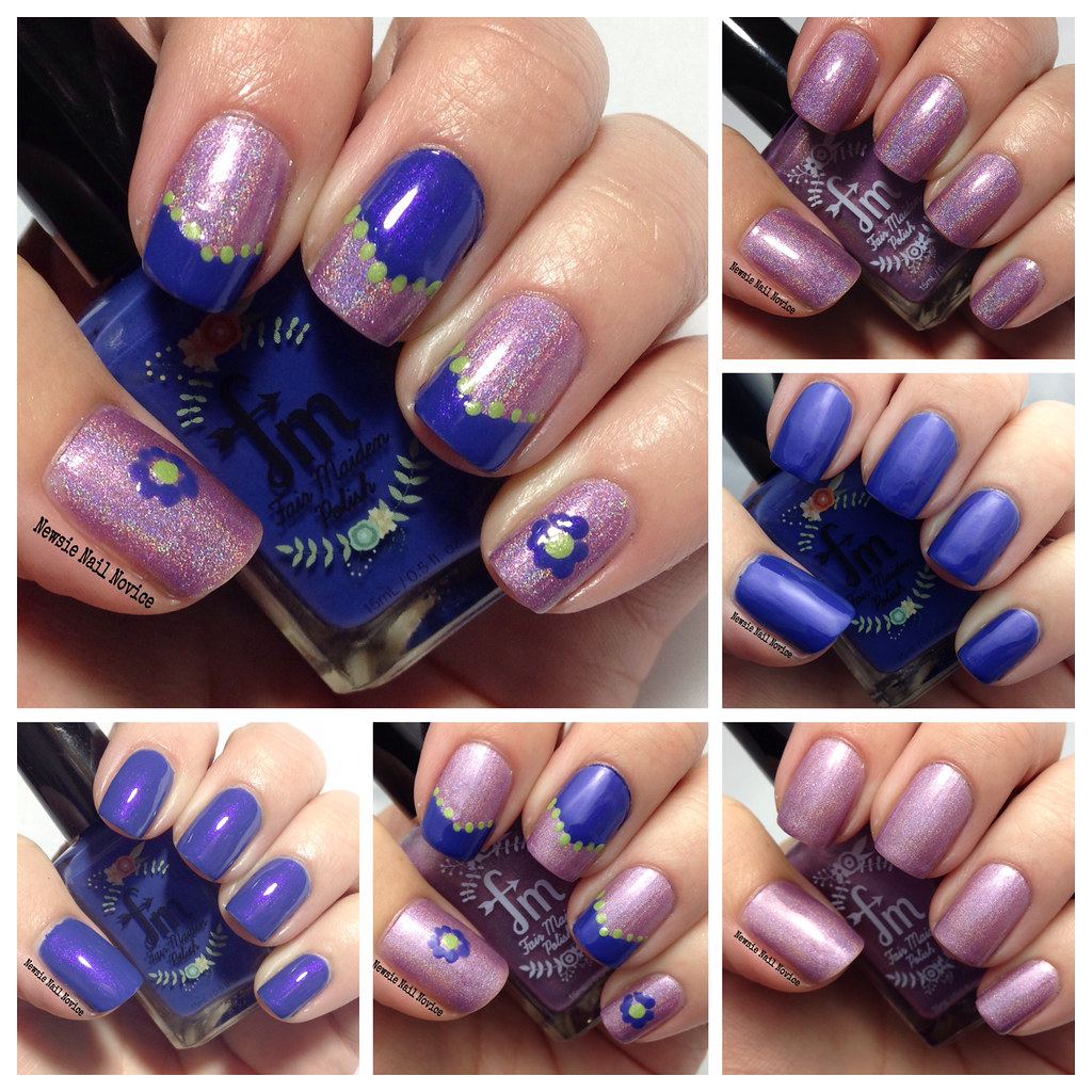
Today I have another press sample to share with you. The lovely ladies at Fair Maiden Polish were kind enough to send me two samples from their upcoming Garden Party collection and boy did I have a ball playing with the polishes!
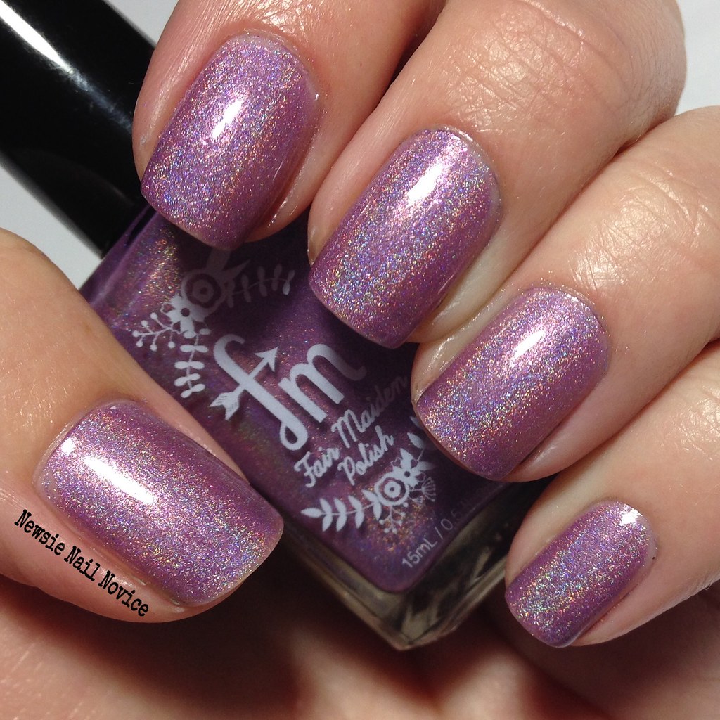
The polishes I am playing with today are Blue Moon Wisteria and Maiden's Blush and they are just two out of the lovely 9-polish Garden Party collection. For a review of the complete collection, make sure to check out The Mercurial Magpie's awesome rundown of the polishes!
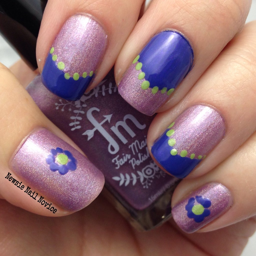
First up we have Blue Moon Wisteria, which is a super difficult polish to capture in a photograph. As you can tell, both these shots look a bit different. I color edited the top one as best I could (but believe me I am no pro). Basically this is a lovely blue leaning lavender creme, which photographs way more blue than it is in real life. It is pretty close to the top photo, but even more light purple leaning, and as you can tell in that photo, it has this vibrant violet pink flash that sets the polish apart from your average blurple.
The formula on this polish was a little watery, but not too difficult to work with, just need to be a little careful with application, don't over load the brush and you're fine. Two coats for this opacity.
Next up we have Maiden's Blush, which is a light purple leaning mauve holo with these amazing pink flakies that really make the polish special and set it apart from your average holo polish. Fair Maiden Polish is so talented at always making something special about each polish that makes it unique in each collection.
This polish was opaque in two coats and was a breeze to apply. The consistency was thicker than Blue Moon Wisteria, but just the right thickness that made application easy like buttah!
Now on to the nail art!
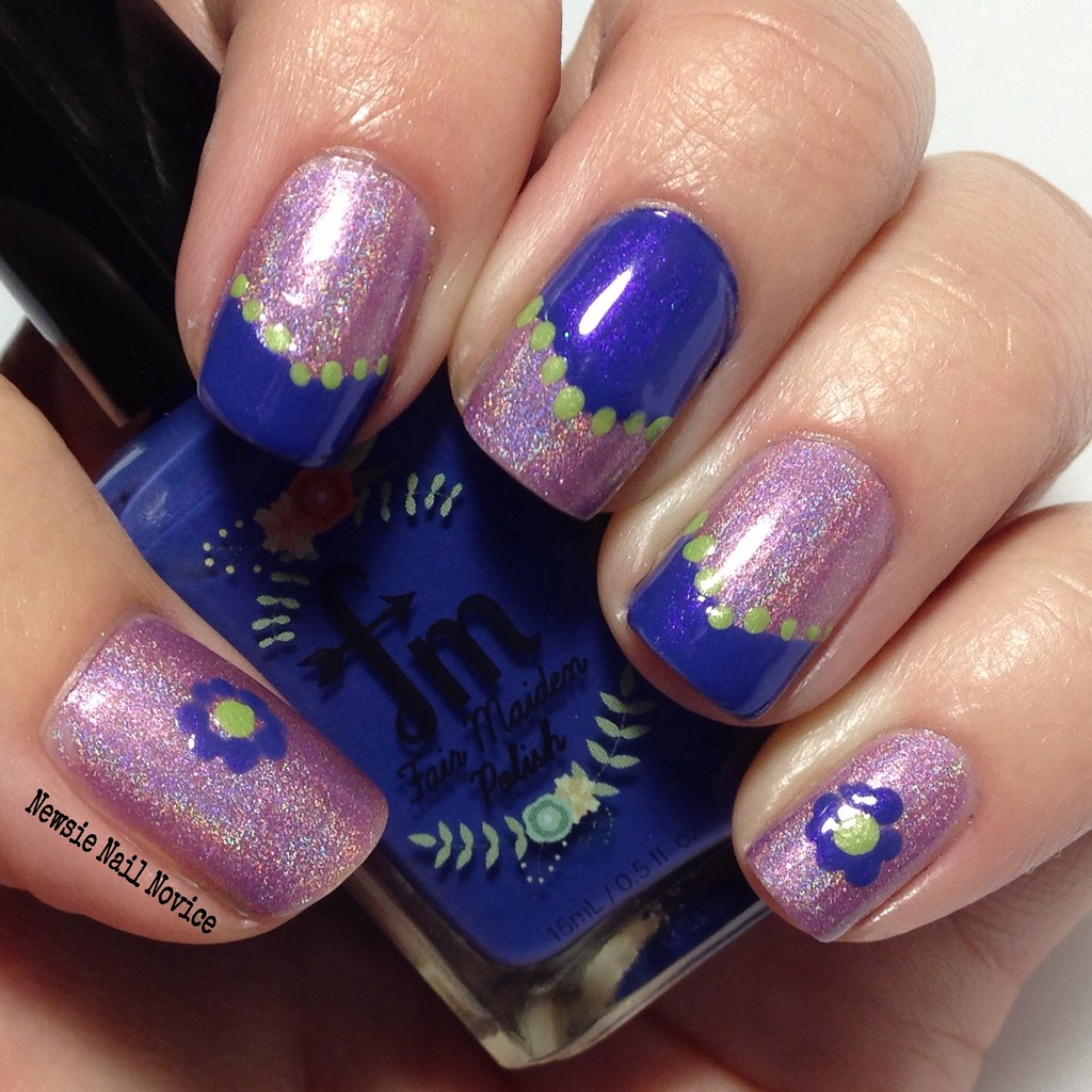
As you can immediately tell, I did not color edit these photos, so Blue Moon Wisteria is looking a bit more blue than it actually is. But the lovely violet flash in Blue Moon Wisteria compliments the purple tones in Maiden's Blush perfectly. They paired quite well together!
I added the green (which is Zoya Tracie) because I thought it contrasted well with both polishes and added that something extra! I used nail vinyls to create the funky french look and then used a dotting tool to add Tracie to the mix! Then because this polish is from the Garden Party collection and I just had to add something floral, so I used the dotting tool again to make a pinkie and thumb flower!
Now I bet you're wondering, "how can I get my hands on these polishes?!" These polishes will be available at the Fair Maiden Polish website at 10 a.m. CTS March 21. Their polishes usually sell out quickly, so if you want to snag a few, make sure to send yourself a reminder, I know I will! But if you miss this stock of the collection, the makers have said these polishes will return to their site, so have no fear!
So have you tried Fair Maiden Polish before?! Which are your favorite from their upcoming collection? I know I want to snag Gilded Garden, Sweet Honeysuckle, Green Goddess and Mint Succulent!
Tuesday, March 17, 2015
St. Patrick's Day Nails
Happy St. Patrick's Day everyone! Can I make a confession? I love nail art and all, but I'm getting a little tired of being expected to do holiday nails. I don't know, sometimes it's all just a little too cutesy I guess. So I hope I didn't phone this one in too much!
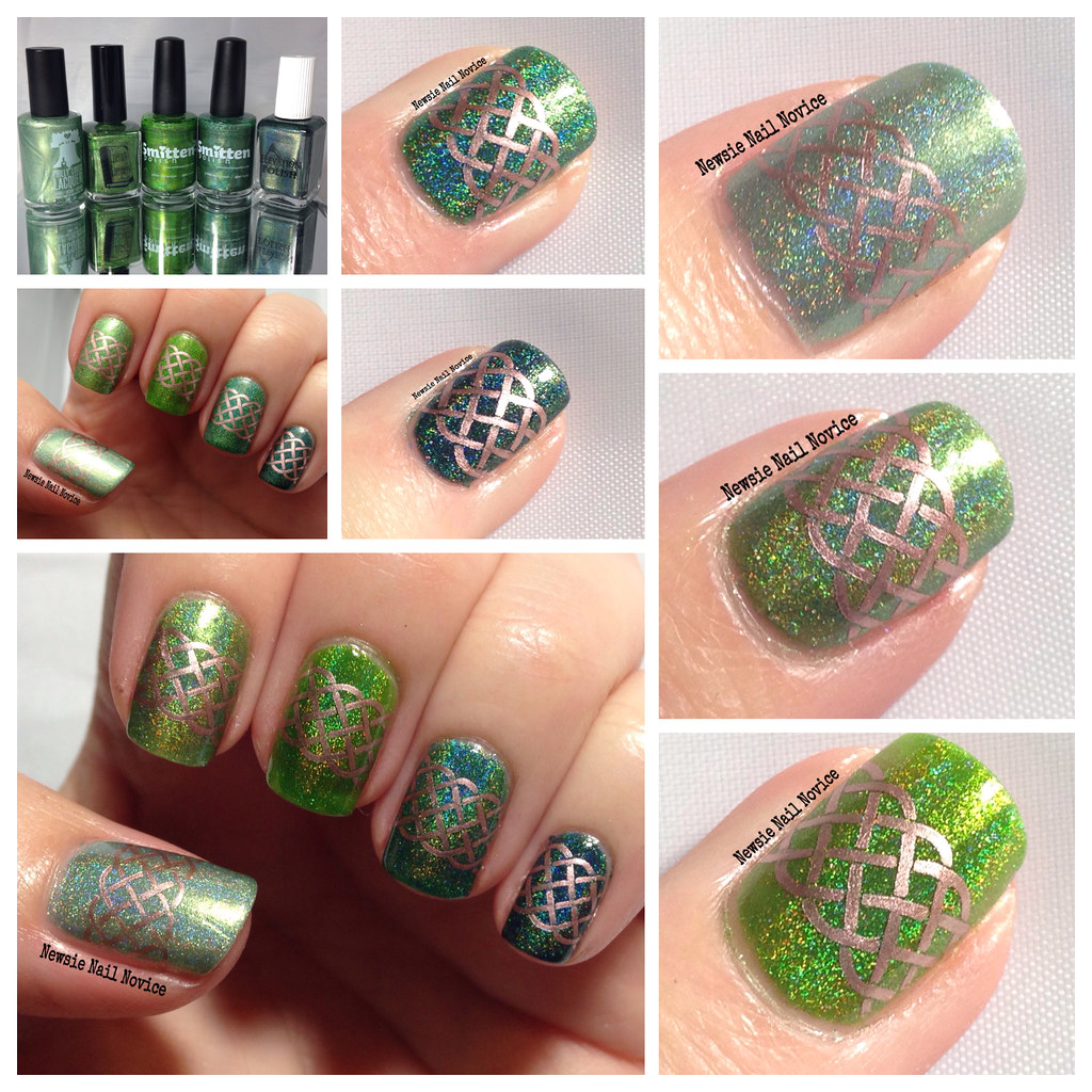
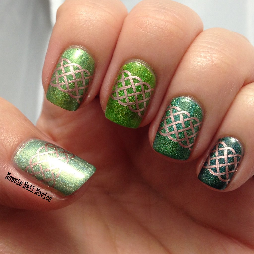
One thing I definitely love is green! It's my favorite color! And so you better believe I have a ton of green polish to choose from. And hello, it's me, so it just had to be holo polishes for this look! And I decided, since I'm not totally into the holiday theme, that I'd also use this post to practice my macro shots. Now I don't have some fancy lens, I just use this app I paid a few bucks for. It's called Camera + and it's definitely not as great as those amazing shots other bloggers have, but it works for me for now.
Ok so the stars of the show here are, from thumb to pinkie, Philly Loves Lacquer Fortunate Rainbow (from the Addicted to Holos Indie Box), Literary Lacquers Shift of Fate, Smitten Polish Girl Sprouts and Enchanted Forest and Elevation Polish Into the Darkness 2.
I used Bundle Monster BM-H05 for the stamp and was inspired by a look I saw on CopyCat Claws about a week ago, thanks Serene! I used Essie Penny Talk to stamp with!
Ok, on to my pathetic attempt at macros!
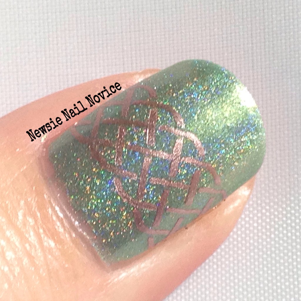
This is Philly Loves Lacquer Fortunate Rainbow, and it's more of a metallic light green holo with the slightest hint of blue. Opaque in 2 coats.
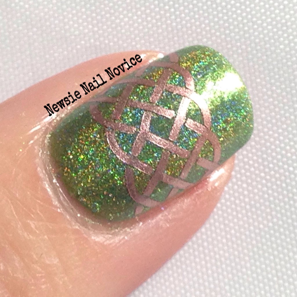
This is Literary Lacquers Shift of Fate and it is the gorgeous unique bright green holo that has bright green flakies throughout. This was opaque in 2 coats, but I added a third for ultimate sparkle.
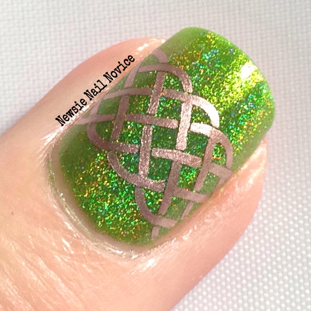
Next up, what I consider the most gorgeous macro of the bunch photo-wise, is Smitten Polish Girl Sprouts. This is a classic bright lime green polish. Probably the absolute brightest of this bunch. Opaque in 2 coats.
This is another Smitten Polish, Enchanted Forest. This polish had a more subtle holo than Girl Sprouts, and the formula was a tad thinner. Opaque in 3 coats.
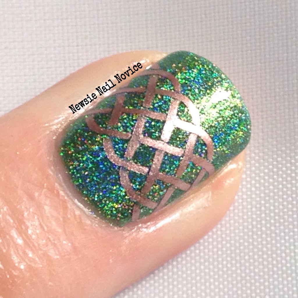
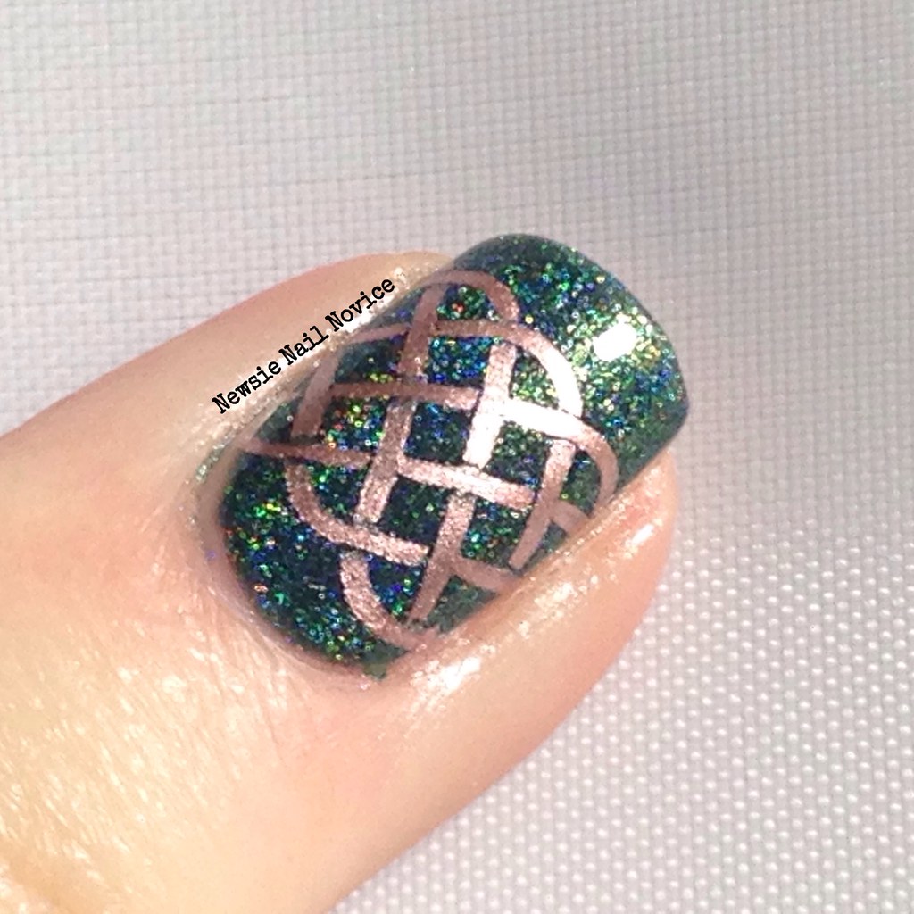
And finally we get to Elevation Polish Lost in Darkness 2, which I'll talk more about in my Elevation Polish post I'm planning for later in the week. This polish is a gorgeous teal leaning dark green that is opaque in one coat. But of course I added two for good measure.
What do you think? Should I keep giving the macros a shot, or do they just pale in comparison to others who have those special lenses? Which of these greens is your favorite?
And do any of you get tired doing holiday themed manis? It feels like every month brings on a new holiday, and thus a new expectation that I'm not even that into to begin with. I'm ready to say blah to it all and just do beach/ocean themed nails for eternity (they are my favorite of course)!
Subscribe to:
Posts (Atom)