
Let's face it, neons are everywhere right now, and I have three different neon purples I wanted to see side by side – so I created this simple gradient three dot dotticure so we could compare these purple neons!
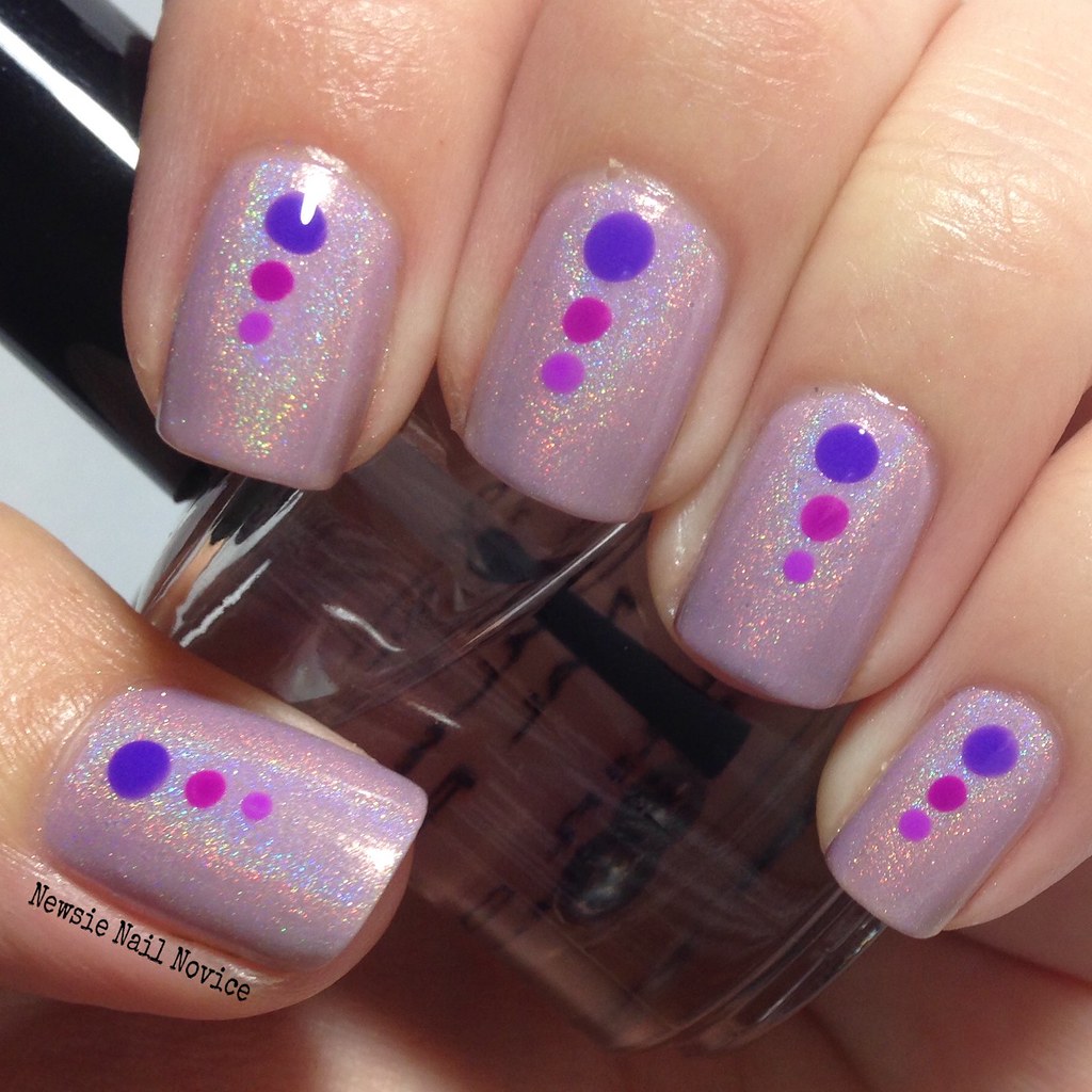
For the background I used the lovely Octopus Party Nail Lacquer Petal to the Metal. Petal to the Metal is a lovely soft lilac holo with a lovely golden glow and subtle iridescent golden flakies (you can see those puppies later in the macro shots).
The application for this polish was smooth as butter. Two coats for this opacity and it was not difficult to work with at all. I've really been enjoying this brand a lot lately and the fun ladies of the Octosquad! I've got a few polishes from Dave's summer collection coming to my mail box as we speak.
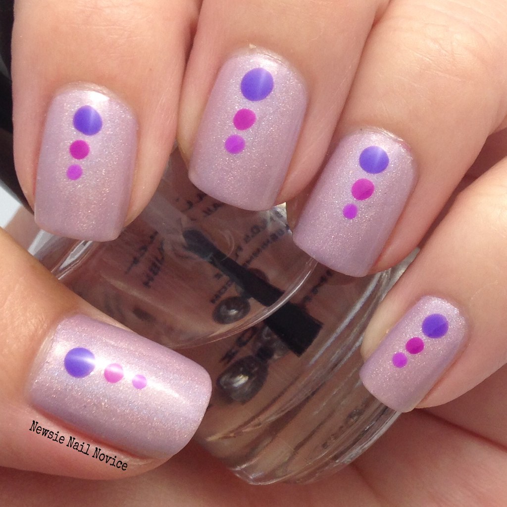
Anyway on to the purple neons. We have from bottom to top: Indigo Bananas Phlogiston Paradise*, Indigo Bananas Zinc Industries*, and KBShimmer Sarong Place, Sarong Time.
Let's check out some macros to really take a close look at the dots side by side!
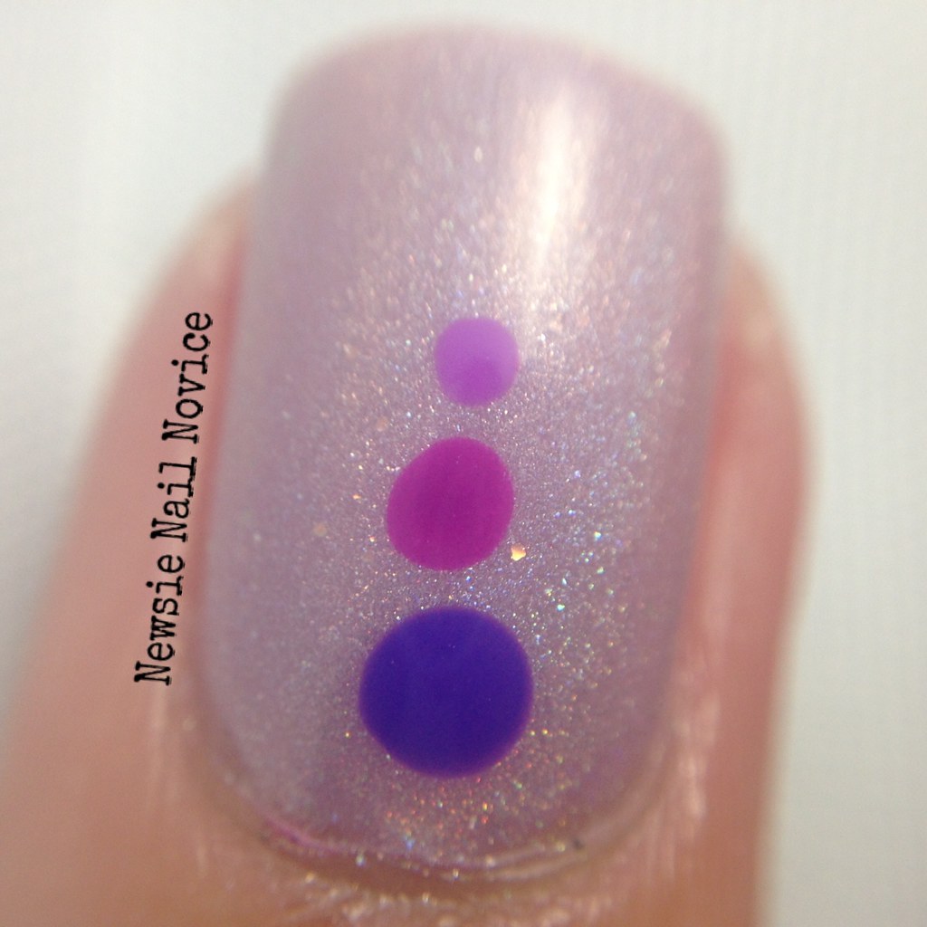
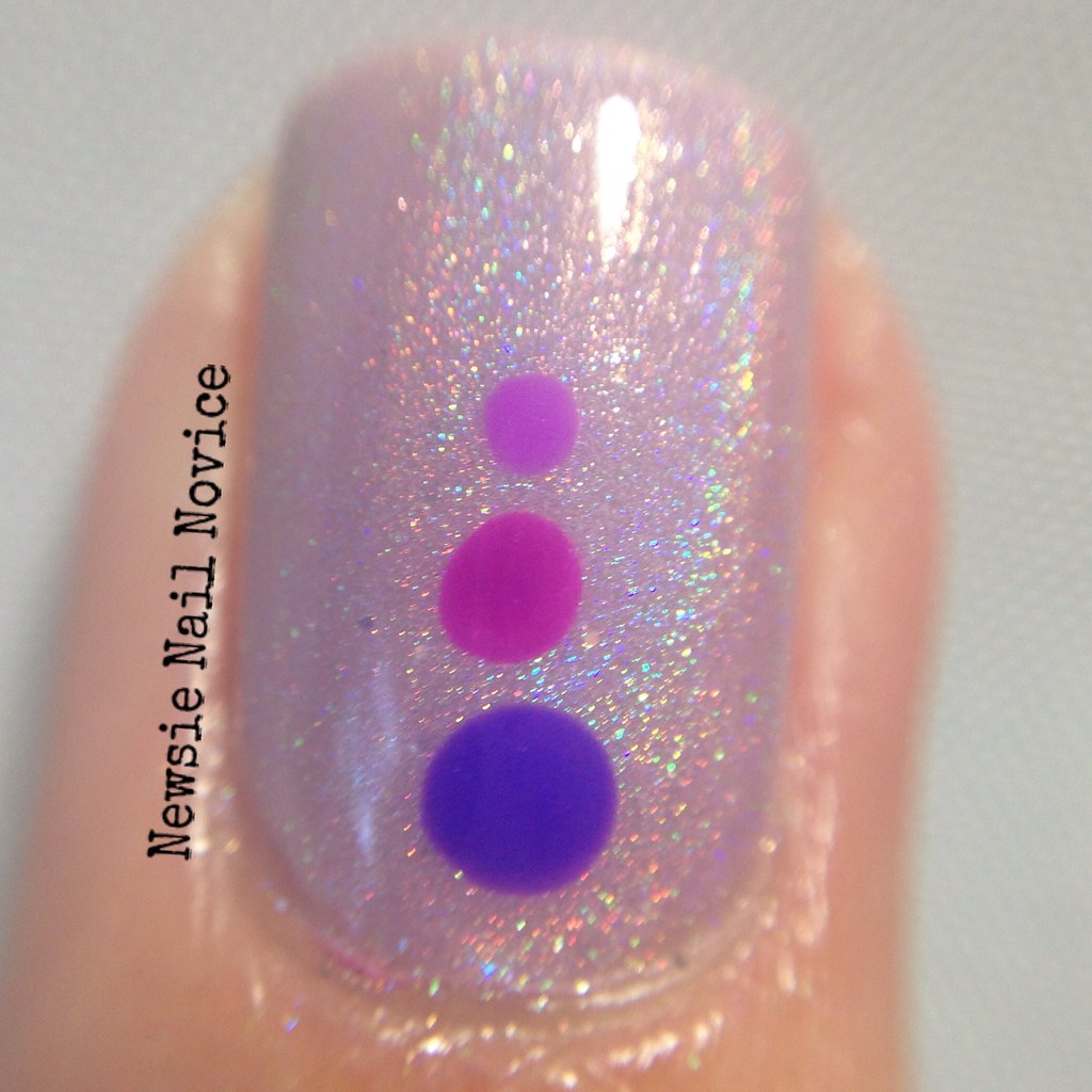
As you can see Phlogiston Paradise is a more blue based bright purple. I've been wearing this as a pedicure and I love it. It was seriously the purple I have been searching for forever! Zinc Industries is the more magenta leaning bright purple, and Sarong Place, Sarong Time is the same hue of purple almost with a tinge of coolness. The KBShimmer also seems to be a tad lighter than the Indigo Bananas.
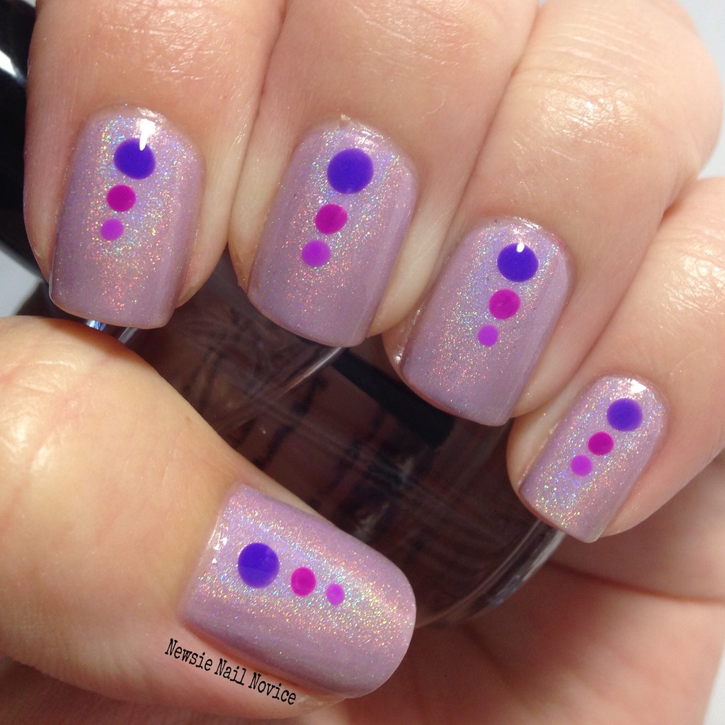
I really liked how simple this look turned out and I think it as a great way to show off the differences in these three bright beautiful shades.
So which of these purples floats your boat? What do you think of the three dot look? I'm liking it as much as the double side dot! :)
*Press Samples
No comments:
Post a Comment